

OEM Corrugated Boxes That Elevate Product Protection and Brand Identity
2026-11-16
Shipping damage rarely announces itself with a dramatic collapse. More often, it’s a corner crushed just enough to compromise the seal, a side flexed during stacking, or a print scuffed until your logo looks tired. That’s why the right corrugated box isn’t just a container; it’s the quiet negotiator between your product and the real world. At Zemeijia, we approach OEM corrugated boxes as a chance to close that gap, matching board grades, flute profiles, and structural details to your specific item rather than settling for a close-enough stock option. The result is packaging that protects like it was designed for the task, while carrying your brand identity with enough clarity to make the unboxing feel intentional. In this post, we’ll look past the generic brown box and explore the decisions that actually move the needle, from material choice to print finish, so your packaging works as hard as the product inside it.
When the Carton Becomes the First Physical Greeting
A parcel rarely arrives in silence. The scuffed edges, the strip of tape pressing down a corner, the slight give when lifted—those details speak before the contents are ever seen. Long before a tracking update or a confirmation email, the carton itself has already said hello. It carries the weight of distance, the residue of sorting rooms, and yet it still manages to feel like something meant for one person.
Inside, the greeting continues in small choices that no invoice can capture: the fold of tissue paper, the texture of a handwritten note, the way an item is nestled rather than simply packed. These are not decorative afterthoughts. They set the tone of an encounter, deciding whether the first physical contact feels hurried or considered. A box can be efficient without feeling cold, just as it can be plain without feeling careless.
Unlike a message that vanishes with a swipe, the carton often lingers. It might sit by the door, become a hiding place for a child, or end up holding winter clothes. That afterlife makes it more than packaging. It becomes a small piece of the household, a physical reminder that someone prepared something, sealed it, and sent it across distances to be opened by hand.
Material Weight, Fluting, and the Quiet Signs of a Thoughtful Brand
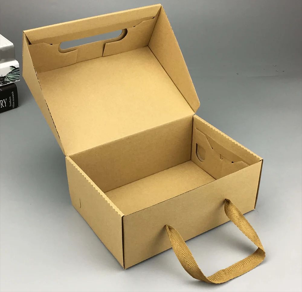
Pick up a well-made box and the first thing you notice is rarely the logo. It's the weight. A slightly heavier card stock, a fraction more substance than expected, and your fingers slow down. That hesitation isn't accidental. Brands that obsess over material weight understand that heft reads as care before a single word is processed.
Fluting is even quieter. The internal ridges of a corrugated sheet rarely get seen, but they shape how a package flexes under pressure, how it springs back after a squeeze, even the dull thud it makes on a table. Choose a finer flute and the surface stays smoother for crisp printing; go coarser and the box feels rugged, almost agricultural. That choice is part of the product's voice.
None of this announces itself. There are no labels pointing to the 300gsm stock or the B-flute profile. Instead, the details accumulate. A flap that folds back with the right resistance. An edge that doesn't bite. These are the quiet signs of a brand that has thought through the full arc of holding, opening, and living with the object long after the purchase.
Print Choices That Hold Up to Real Handling
Most print materials only have to survive a quick glance, but pieces that get handled daily reveal weaknesses fast. The difference usually comes down to choices that are easier to feel than to describe: how an edge resists softening, whether a matte finish smudges under warm fingers, and whether the piece still lies flat after being slipped into a bag.
A few practical moves make a bigger difference than upgrading to the heaviest stock. Look for coatings that take friction without turning greasy, avoid delicate foil details on high-contact areas, and choose a laminate or varnish that flexes rather than cracks at the fold. Even small things like rounded corners or a slightly textured cover stock can hide the kind of wear that makes a printed piece look tired after a week.
Before committing, it helps to test the way people actually handle the finished piece: thumb through it repeatedly, stack copies, slide one into a laptop sleeve, or leave it on a counter for an afternoon. If the surface still looks intentional after that, the print choice is probably sturdy enough to earn its place in someone's hands.
Box Geometry That Stops Movement Before It Starts
A box is rarely just a container; its angles, tapers, and internal shoulders often do the work of a brake. The moment a product or die-cut insert meets a sloped wall or a narrowed throat, the contact patch shifts from sliding to wedging, and the geometry converts forward momentum into a static lock.
That stop can come from a slight draft angle on a molded pulp tray, a folded flap that creates a ramp, or a corner gusset that closes down available clearance. Because the interference is built into the blank rather than added as a separate component, the assembly sequence stays simpler while the hold becomes more predictable across repeated cycles.
Even a few degrees of taper can do more than a tighter tolerance would; the angle spreads force across a larger face, reducing the chance of bruising or edge wear while still refusing to let the part travel past its intended seat.
Inserts and Dividers That Turn Fragile into Predictable
Most damage is not caused by a weak outer carton. It starts when the item inside has enough open space to move in ways the packaging never anticipated. A well-fitted insert or divider changes that by locking each piece into a defined cell with controlled clearance. Once the product stops drifting into the carton walls or into adjacent parts, the same drop height and the same carrier produce the same outcome instead of a lucky one.
The design should follow how the object actually moves under impact, not just how much cushioning can be added. Tall narrow parts benefit from scored dividers that prevent mid-box contact. Heavier pieces with sharp corners tend to need die-cut foam or molded pulp blocks that hold orientation while absorbing energy at specific pressure points. Restricting motion in the right places does more than wrapping the entire item in bubble film because it removes the collision paths rather than softening them after they happen.
Predictability also improves on the packing line. A custom-cut insert works like a visual jig, giving each component one obvious place and one correct orientation. Packers do not have to decide how many layers of wrap feel sufficient, and the box closes with the same level of protection every time. That repeatability is what shifts fragile from a warning label into a condition that can be packed, shipped, and measured with confidence.
Unboxing as the Last Ad You Never Had to Place
The moment a customer lifts the lid off your package, they’re not just checking for damage—they’re deciding whether they’d tell a friend about this. That first reveal is a tiny, private commercial your product didn’t pay for. It works best when the packaging feels less like a shipping container and more like a deliberate first chapter: a hand-written note tucked under the flap, a custom sticker that makes the box feel chosen, not just shipped. These details don’t cost much, but they quietly shift the unboxing from “is the item okay?” to “this brand thought about me before I even opened it.”
Most companies save their messaging for a landing page or a retargeting campaign, but the inside of a box is one of the few places where attention is completely yours—no algorithm, no competing tab, no autoplay. A simple thank-you card with a specific, human line (“Hope this makes your Tuesday easier”) outperforms a glossy brochure because it doesn’t feel manufactured. The trick is restraint: two or three considered touches, not a confetti explosion. When a customer films their unboxing, they’re not showing off the bubble wrap; they’re showing off that someone wrapped the product like it mattered. That’s the ad you never had to place.
FAQ
Focus on board grade and flute profile rather than thickness alone. A C-flute with a higher edge crush test value often handles stacking pressure better, while double-wall construction gives extra puncture resistance for sharp or dense products.
It can. The box is usually the first physical touchpoint. Clean registration, consistent brand colors, and matte or water-based coatings tend to make the packaging feel intentional instead of generic, which quietly reinforces that the product inside was made with care.
If your product range varies widely, start with a few insert-friendly standard sizes. Once order volume grows, custom dimensions reduce void fill, cut dimensional weight charges, and keep items from shifting during transit.
Yes. Recycled linerboard, water-based inks, and adhesives without harsh solvents are common now. You can also design for a single material structure with no plastic tape or labels, making the box easier to recycle after use.
Look for reinforced corners, full overlap flaps, or die-cut inserts that hold the product away from the outer walls. Even a small change like increasing the flap overlap can spread impact force across a wider area.
Many suppliers now offer digital printing and short-run converting, so you can test a design without committing to thousands of units. It is useful for seasonal launches or limited product lines, though unit costs will be higher than bulk runs.
Sometimes a single accent color, an embossed logo, or a printed interior pattern does more than full-coverage graphics. Using a higher-quality liner only on the outside face can also improve print sharpness while keeping the overall board cost reasonable.
Avoid overpacking with oversized boxes, ignoring the filled weight of the package, and using artwork that looks crisp on screen but loses legibility on kraft surfaces. Prototyping before full production catches most of these issues.
Conclusion
A carton is often the first physical greeting a customer receives, yet it rarely gets treated that way. When the board is selected with real intent, the difference shows up in small, tactile ways: a flap that resists buckling under warehouse stacking, a printed logo that does not turn chalky after belt friction, a surface weight that feels substantial without being wasteful. OEM corrugated boxes let these choices work together. Flute height and liner weight are not just spec sheet details; they shape how the package absorbs shock, holds its corners, and carries brand colors through rain, dust, and repeated handling. Even a matte finish or a restrained one-color print can quietly signal that someone thought past the loading dock.
Real protection begins before the tape is applied. Box geometry should do the first job of restraint, with scored shoulders, locking base panels, and tight corner trays that stop lateral movement instead of relying on oversized cartons and loose fill. When fragile products are involved, inserts and dividers turn an unpredictable drop into a predictable outcome, holding each piece in its own cell so nothing grinds against a neighbor. The payoff arrives at the last step. A clean opening sequence, a single protective sheet removed without confusion, and the product sitting exactly where it should be feel like an unplanned advertisement. It is the kind of ending that no paid placement can replicate, because the box has already delivered the message physically.
Contact Us
Contact Person: Sasha Du
Email: [email protected]
Tel/WhatsApp: +86 13869836645
Website: https://www.zmjpackagings.com/